


Overview
Form Field types describes standard field types and their principles for Retail Arena reports and applications. The purpose is to inform the user and make them more efficient in using the program.
Forms Field Operation Types
From a data editing perspective there are 3 field operation types. These are:-
- Primary fields.
- Index fields.
- Standard fields.
Primary and Index fields are both classified as Search fields and are used in data editing forms. Standard fields are used in both data editing and report criteria forms. These are discussed in the next sections.
By default, the toolbar enables and disables fields depending on the mode of the form as shown below:-
| Field Operation Type | Print Mode | Search Mode | Edit Mode | New Mode |
| Primary Field | Enabled | Enabled | Disabled | Enabled** |
| Index Field | Enabled | Enabled | Enabled | Enabled |
| Standard Field | Enabled | Disabled | Enabled | Enabled |
** If a form contains a data grid, the primary field is disabled in New mode as soon as the user enters a valid record in the grid.
Search Fields
In almost all cases a data editing form has one or more search fields simply because the user must be able to search for data to edit. The only exception to this is where the application always edits the one data record, in which case search would be meaningless.
There are two types of search fields:-
- Primary Search fields: Primary fields uniquely identify the record being edited. In the above example the ID field is the primary field because every user must have a unique ID. While there is only one primary field on this form, applications may have more than one primary field.
- Index Search fields: An index search field allows the user to search for a record using fields other than the primary fields. In this example the Name field is an index field. It is not unique because two users may have the same name, but it is useful as a Search field because the operator of the form may know the name of the person they wish to edit but not their ID.
When the user searches for a record and clicks Edit to edit it, the Primary search fields are disabled. This is because primary fields uniquely identify the record being edited and therefore cannot be changed. Index search fields however are enabled in edit mode. In this example it makes sense that you can change a users name but not their ID.
Refer to the article Searching For Data later in this chapter for specific help with using the search fields to retrieve data.
Standard Fields
Standard fields include all other fields on a form other than search fields. Generally standard fields are only enabled in Print, New and Search mode although this is not always the case. A developer for example may use a View field to display data but not allow it to be edited regardless of the mode.
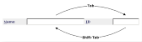
Moving Between Fields
Use the Tab key to move to the next field or hold down the Shift key and press Tab to move to the previous field (Shift-Tab).


If the field's title has a shortcut key, you can move to it by holding down the Alt key and pressing it. For example the title of the Ppassword field has the letter P underlined indicating it's shortcut key. Alt-P will move the cursor to that field.
Form Validation
Before a form can be processed, all fields on the form must contain valid data. What constitutes processing a form depends on the type of form:-
- For a Report Criteria Form, processing means pressing the Print button to display the report.
- For a Data Editing Form, processing means pressing the Ok button to save your changes.
When a user clicks either of these buttons to process the form, the form checks each field to see if it contains valid data. If a field is invalid, the cursor will move to the field and the form will not process. You will be unable to process the form until all invalid fields have been corrected.
Note, a developer may define a field as Required, and a required field is invalid if it does not contain any data.
Types Of Fields
There are five WebTools field types:-
- Text Boxes
- Check Boxes
- Text Areas
- Select Boxes
- Data Grids
Each of these are discussed in the sections below.
Text Boxes
Text boxes are commonly used because they support text, date and number data types together with contained and lookup validation.
Text Box Data Types
Date Text Boxes only allow you to enter the 0..9, / and . characters. Dates are entered in the format nn/nn/nnnn or nn.nn.nnnn and WebTools automatically checks that the entry is a valid date and formats it correctly. Note that the developer defines whether the date is in Day/Month/Year or Month/Day/Year format.
Assuming the date format of a field is Day/Month/Year, the following date

could have been entered by the user as one of 15/3/01, 15.3.01, 15/03/01, 15.03.01 (with a 2 or 4 digit year) and WebTools would have formatted the field as shown above. If the user enters an invalid date, the entry is displayed in an error color:-

Number Text Boxes only allow you to enter the 0..9, . and - characters. The developer defines the number of decimal places and WebTools automatically checks the entry is valid and rounds it to the preset number of decimal places. The number of characters that can be entered is defined by the developer.
As with a date text box, an invalid entry is shown in the error color.
Text Text Boxes allow any character to be entered. The developer may format the text box as upper case or lower case, or leave it undefined to support any case character. The number of characters that can be entered is defined by the developer. Generally any entry is valid for a text box although the developer may implement some custom validation.
Text Box Validation
Text boxes may support either contained or lookup validation.
Contained Validation Field
When a form loads for the first time, fields that use contained validation are loaded with all their valid values. When the user selects the field, the list of values is displayed for the user to select the appropriate value. If the field is blank when it is selected, only the first 10 items are displayed. If there are less than 10 items in total, all of them are displayed.
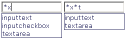
To progressively limit the list enter one or more letters. In this example, "i" is entered to show only those items beginning with "i".

To select an item use the Up and Down arrow keys and press tab. Tab enters the currently selected value into the field and moves the focus to the next field. Alternatively select the desired item with the mouse pointer and press the Tab key.
The wild card character * can also be used to limit the selection as shown below where the list is limited to all items containing an x, and then an x followed by a t.
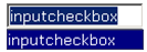
If a validation field already contains a valid entry and the user selects it, only the current entry is displayed in the list as shown below.
To redisplay the full list, delete the current entry.
Lookup Validation Field
Lookup validation fields operate similarly to contained validation fields except that they are not loaded with their valid values when the form is loaded.
Lookup fields are recognized by the magnifying glass icon that appears to the right of the field when it is selected. Enter one or more letters and optionally wild card characters and press the Enter key. When Enter is pressed, WebTools performs a lookup against the database and returns a list of all items that match the entry. In this example the user has entered "c" and pressed Enter to return a list of all items beginning with c.
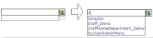
Once the list is returned, the field operates similarly to contained validation fields. In this example only four matching items were returned. If however more than 10 items were returned, only the first 10 would be displayed and the user would need to enter more characters to limit the list further if the required item was not in the first entries.
Check Boxes
Check boxes are common for Yes/No answers. To turn on or off the check on a check box either:-
- Click the check box with a mouse.
- While the check box is selected, press the space bar.
- Press Alt-Shortcut Key. If for example the S in a check box description was underlined to indicate the shortcut key, Alt-s would toggle the check on or off.
Text Area's
Text area's are used to enter large amounts of text.

Select Boxes
Select boxes are another form of field with validation.

A select box may support multi-selection as shown above, or single value selection where only one item in the list may be selected. For multi-select boxes, select the first item with either the mouse or by moving the arrow keys while the field has the focus. To select a range of items, select the first item as described in the previous sentence, then hold down the shift key and either click the last item in the range with the mouse or use the arrow keys to move to the last item. To select non-consecutive items, hold down the Ctrl key and click each item with the mouse.
Data Grids
Refer to the article Data Grid Behavior for a full explanation of data grids.